Marketing - HOW TO CREATE A SUCCESSFUL LOGO
HOW TO CREATE A SUCCESSFUL LOGO

Don’t start working on your PC immediately! Take paper and pen and start sketching, as soon as you have come up with good ideas, you can start using your computer – don’t think about just one option: creating numerous alternatives would be easier if you come up with numerous objectives.
Which software you have to use? Main alternatives are:
Introduction
For some years I'm interested in marketing and especially in logos, elements that took me to attend Ciels and starting to produce a thesis about this topic.
Today, in this article which is written in English, we'll talk about an important topic which in part relates to my thesis. It regards logos and in this case we'll explain how to create a successful one because it's vital to have a sign to be recognizable from customers.
A logo is more than a symbol, in fact, a good projected logo could be more impactful as other strategies to attract customers: a logo is considered as "your sign" which gives you pieces of information about your business. Therefore your logo should be properly designed, meaningful, and memorable. That's because I choose this article from Ninjamarketing explaining how much is important to create a successful logo.
The importance of a logo and what renders it successful
A logo
is a fundamental element for a brand, it contributes to creating the identity
of the company through the use of colours, symbols and fonts
and allows the consumer to differentiate
it from its main competitors. At
a glance, consumers can perceive the true essence of the businesses/brand
itself/companies.
What renders a logo successful?
A logo should follow some basic principles in order to effectively stand
out and be remembered by the consumer.
It has to be:
1. Simple
2. Easy to remember
3. Everlasting
4. Versatile
5. Appropriate
Obviously, these are general principles based on my experience on the field and from many sites and books dealing with this
topic professionally: there are examples of well-known logos that have contradicted one or more of these
principles, but twist the rules you must first know them!
Let’s see the ideal characteristics for an eyecatching
logo in more detail:
1. Simple
The imperative is “keep it simple”. Simplicity makes a logo easily
recognizable, versatile and difficult to forget, enabling it to be unique without being
full of useless details. All the “extra” should be deleted, avoiding intricate and complex details, bearing in
mind that colours should be maximum three. Colours that are too bright, neon or too dull should be
avoided and the fonts should be easy to read. Moreover, it is better not to use more than
three fonts and remember that the logo should be placed in the middle of the
page (superior or inferior margin).
Consider the Nike logo: it is a very simple and minimalist
stylized wing (rumours said that it cost only 35 dollars!) and has
become one of the most well-known symbols in the world.
2. Easy to remember
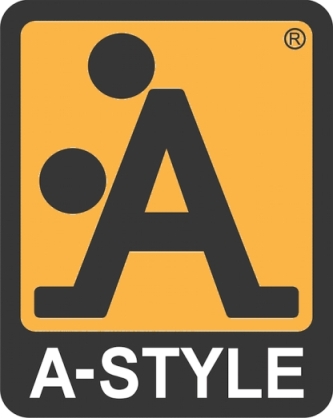
It could be useful to use elements that either relate to the business itself or the elements recall the social contexts: if the brand naming is easy to remember, you can use it for the logo – but, the most important detail is focusing on an original/even provocative logo design – if you want provocative too (as in the case of/the example of clothing brand A-Style, see photo) – which has a strong impact and, once again which is imprinted in customers mind and which he is unlikely to forget.
It could be useful to use elements that either relate to the business itself or the elements recall the social contexts: if the brand naming is easy to remember, you can use it for the logo – but, the most important detail is focusing on an original/even provocative logo design – if you want provocative too (as in the case of/the example of clothing brand A-Style, see photo) – which has a strong impact and, once again which is imprinted in customers mind and which he is unlikely to forget.
3. Eternal
Don’t try to follow the latest trend, however, aim at creating something
that would be
meaningful even in 20
years time. A good design, in fact, is not afraid of the passing of
time and
logos as Coca-Cola are as contemporary as modern than ever.
4. Versatile
The logo should be designed in a vector-graphics format so that it could be adapted to any size: vector
graphics is a technique that is used when images have to be enlarged or made smaller
without losing details and avoiding the “graining”/shelling effect – to obtain that you need to
use programmes such as Adobe Illustrator or Corel Draw.
In addition, the logo should be effective
also in black and white version: it could be necessary, in the future, to
reproduce it on a billboard as
well as on a business card or a small gadget… a logo that is too rich in detail
would not be recognisable; it is vital to choose the
elements which compose so that are clear, legible and identifiable in any type
of situation and format.
Lastly, don’t forget the printing costs: the more colours you use, the
more expensive it will be for your business in the long term.
5. Appropriate
The logo must adapt to its potential audience: vivid colours and childlike details are
perfect for a toy store but they are without doubt out of place in other contexts. It must be consistent with what the products it represents;
beware however not to make another mistake: the logo does not
necessarily have to illustrate the activity of your company explicitly:
Apple’s logo is not a computer, Mercedes’ logo is not a car and Lacoste’s is not a polo shirt.
So, how to proceed to create a logo?
1. Search the inspiration
Start
thinking about what the company does, what objectives it sets itself,
which is your
target and what it wants to convey through its logo:
start designing the style you want
to give the logo, bearing in mind the five principle
just seen before. Are you searching
for inspiration?
There are a lot of useful sites that could help you to open your mind
and help unleash all your creativity:
- Logo of the day is a site that rewards the best examples of logos coming from all over the world
- Brands of the world is the biggest logo collection that can be downloaded in vectoral/vector-graphics format
- Logomoose offers a selection of original and creative logos
- Logofaves is constantly is constantly scanning designers' portfolios and in order to classify the best logos.
2. Check it out
Are you worried
that the logo (or name) you have chosen has already been used? To clear any doubt/to
answer your questions there are different sites you could consult:
- IPTO - Italian Patent and Trademark Office
- European Office Database
- WIPO - World Intellectual Property Organization (for international brands)
Don’t start working on your PC immediately! Take paper and pen and start sketching, as soon as you have come up with good ideas, you can start using your computer – don’t think about just one option: creating numerous alternatives would be easier if you come up with numerous objectives.
4. Digitalise the logo
To draw your
logo on the PC you have two alternatives:
- scan the drawing and then “trace” it on your PC
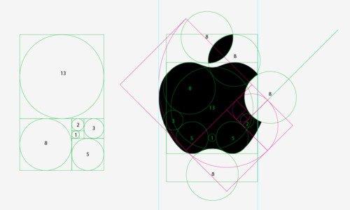
- work directly on your PC, using the design tools that are available in in the programme you have chosen to use, or, better still, try to recreate the image by breaking it down into in basic shapes (circles, squares, etc.), as you can see in the image above in the Apple logo: this will help you obtain a simpler and clearer design – you could also use a graphics tablet.
Which software you have to use? Main alternatives are:
- Adobe Illustrator, one of the best software to create a logo. It permits drawing in vectoral, allowing you to make smaller and enlarge the image as desired – without losing quality. The only flaw: it is not immediate to use, nevertheless on the Internet you will find lots of tutorials – also in Italian – to learn using it at best.
- Corel draw is similar to Illustrator for the characteristics, according to some people it is also more accurate, although it presents some problems for colour management. Moreover, fewer resources and courses are found to learn how to use it compared to Adobe’s rival.
- Adobe Photoshop certainly is a very common programme utilised a lot on an amateur level. Unlike the previous one, however, is not projected to draw in a vectorial way (this function also exists in the programme but is very limited compared to previous software) so you could have scalability problems.
- Gimp has similar functions to Photoshop, while being much less powerful. However, it has the advantage of being free, you can download it from the official website.
5. Choose the right font
An
important phase concerns the choice of font: to make a logo attractive is often
enough choosing the right font. Don’t limit to utilize the fonts that are
present on your
PC, but search for new and original ones: on the internet, there are a lot of sites that offer collections of fonts:
- Dafont
- My Fonts
- Fonts Shop
- Fonts
- Font Squirrel which offers free fonts of good quality, complete of license, divided by typology. Furthermore, there are some interesting sections: most downloaded – with the most downloaded fonts of the users; newly added, to be precise recently added fonts.
- The League of Moveable Type is a real movement created to collect and distribute open-source fonts
6. Feedback
It
could be very useful to ask for feedback from colleagues – but also from those
who are not involved in the sector, as friends and relatives – after all, the
logo has to impress everyone.
Commenti
Posta un commento